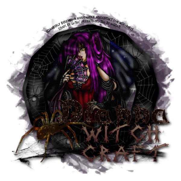
This tutorial was written by Dianna Richards of Digicats (and Dogs)/Di Before Dawn Tutorials. Any resemblance to any other tutorial, published or unpublished, living, dead or undead, is purely coincidental.
Please do not rebroadcast, redistribute or otherwise claim this tutorial or any part there of as your own work.
Items you will need to complete this project:
The Two Friends, Two Styles taggers kit by Gothic Inspirations, which is a PTU kit available at Gothic Inspirations.com.
Tube of choice. I am using Beautiful Yet Deadly, by Amberly Berendson. This is a PTU tube, and you must have a license to use this tube, which is available at MIStaken Art.
Mask of choice. I am using Nik's Grunge100 mask by Nik's Scripts & Scraps which is part of her PSP Masks Mega Pack.
Font(s) and/or alpha of choice. I am using Trash Hand, which is a free to use font that you can snag HERE, and the Bewitched alpha, which is a PTU alpha from Gemini Creationz.
Note that H# and V# refer to Horizontal and vertical coordinates on your canvas grid. Make sure you have View, Rulers checked in order to see the ruler grid.
When I say "Add to your canvas" I expect that you will copy and paste it as a new layer, unless otherwise state in the tutorial.
This tutorial assumes you have a working knowledge of PSP. It was written using PSP X3, but should work in PSP 8 and up.
To begin, open a new raster layer canvas, 800 x 800 pxl, flood fill white.
Open paper of choice. I am using Paper7-GI_TwoFriendsTwoStyles. Layers -> Load/Save Mask -> Load mask from Disk and select mask of choice. I am using Nik's Grunge100. Make sure the fit to canvas box is checked, then click on load.
Resize to 90%. Edit -> Copy Special - Copy Merged and add to main canvas, centered.
Open Brick-GI_TwoFriendsTwoStyles, copy and add to main canvas, centered.
Open Frame3-GI_TwoFriendsTwoStyles, resize to 75% and add to main canvas, centered.
Open tube of choice. I am using Amberly Berendon's "Beautiful Yet Deadly". Copy the tube layer and add to your main canvas, centered.
On the layer pallet, click on Raster3. With you selection tool set to rectangle, replace, select only small portion of the frame down near the bottom where the dress on the tube overlaps.
Select -> Select none.
Copy, then click on the tube layer (Raster 4) and add to main canvas. Realign so that the copied portion matches up with the frame underneath the tube.
Open Web1-GI_TwoFriendsTwoStyles, and add to main canvas, centered at H400, V550.
Open Word Art-GI_TwoFriendsTwoStyles, resize to 75% and add to main canvas, centered at H550, V625.
Open Spider-GI_TwoFriendsTwoStyles, resize to 75%, and add to main canvas, centered at H250, V600.
Starting with Raster 2 and working upward add a drop shadow of choice to each of the layers except the frame copy (Raster 5). I am using offsets, vertical and horizontal of 5 each, opacity of 85, Blur of 15 and color black (#000000).
On the Materials pallet, set your foreground color to transparent and your background color to black (#000000). Using font of choice, add copyright information to the tag. For the "Beautiful Yet Deadly" tube, that information is:
(c)Amberly Berendson harpyqueen.deviantart.com Your MtA-License#
I am using Trash Hand, 4 points, bold and centered, and then I fit the text to path. I also add the background and tagged by information.
You can now save the artist's copy of your tag as a .pspimage file.
Click on the word art layer, Raster 8.
Using font or alpha of choice, add name of choice to tag. I have my name centered at H500, V500, right over the word art. Your placement may vary depending upon the size of the font or alpha and the length of the name you are using.
Add a matching drop shadow to the name.
Drop your white background layer, and merge visible. Resize to 75% (600 x 600 pixels) and save as a .png file and you're all done.
If you are planning on using the tag on Facebook, you might want to save it as a .jpg file, as Facebook's handling of .pngs has changed and the tags look better with the white background on them.
I hope you enjoyed this tutorial. If you should have a problem, please feel free to E-Mail Me and I'll be happy to help you out.
No comments:
Post a Comment